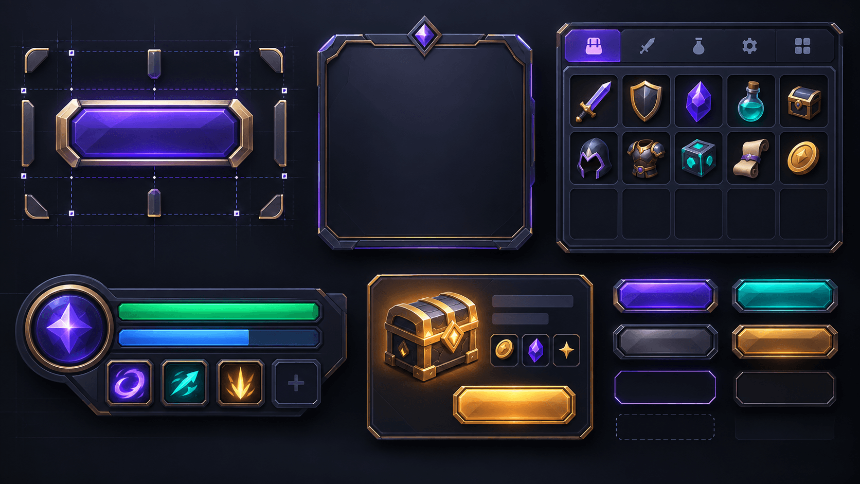
Roblox UI Kit Guide: 9-Slice, Scale Types and a Style That Holds Together
How to build Roblox UI art that survives different screen sizes using 9-slice, UIScale, constraints, readable states and a shared visual system.
AI can make a beautiful button in one image. It cannot decide which pixels should stay fixed when that button becomes a wide shop card, a narrow mobile control or a translated label. Roblox UI becomes production-ready when the art and the layout rules agree.
The most useful mental model is to separate the UI kit into three layers: a visual language, reusable geometry and responsive behavior. The visual language covers palette, corner radius, stroke, shadow and icon treatment. Reusable geometry covers panels, buttons, tabs and badges. Responsive behavior covers Scale, Offset, UIScale, constraints and safe areas.
The decisions that matter
| Problem | Use | Why | Failure mode |
|---|---|---|---|
| Decorative frame stretches | ScaleType.Slice and SliceCenter | Corners stay intact while the middle grows | Rounded corners become oval or the border gets too thick |
| Whole HUD needs controlled zoom | UIScale | Scales the parent and its children together | Text and icons are scaled independently and drift apart |
| Image must stay proportional | UIAspectRatioConstraint | Prevents non-proportional stretching | Square icons turn into blurry rectangles |
| UI needs to fit several screens | Scale, Offset, AnchorPoint and size constraints | Defines the relationship to the parent | Everything is positioned from one desktop screenshot |
| State must be obvious | Normal, hover, pressed, disabled and selected variants | Players need feedback without reading every label | State is communicated only by a tiny color change |
9-slice in plain language
A 9-slice image divides a frame into nine regions. The four corners do not scale, the top and bottom edges scale horizontally, the left and right edges scale vertically, and the center scales in both directions. Roblox exposes this through ImageLabel or ImageButton with ScaleType set to Slice and SliceCenter defining the boundaries. The ImageLabel documentation is the authoritative reference for those properties.
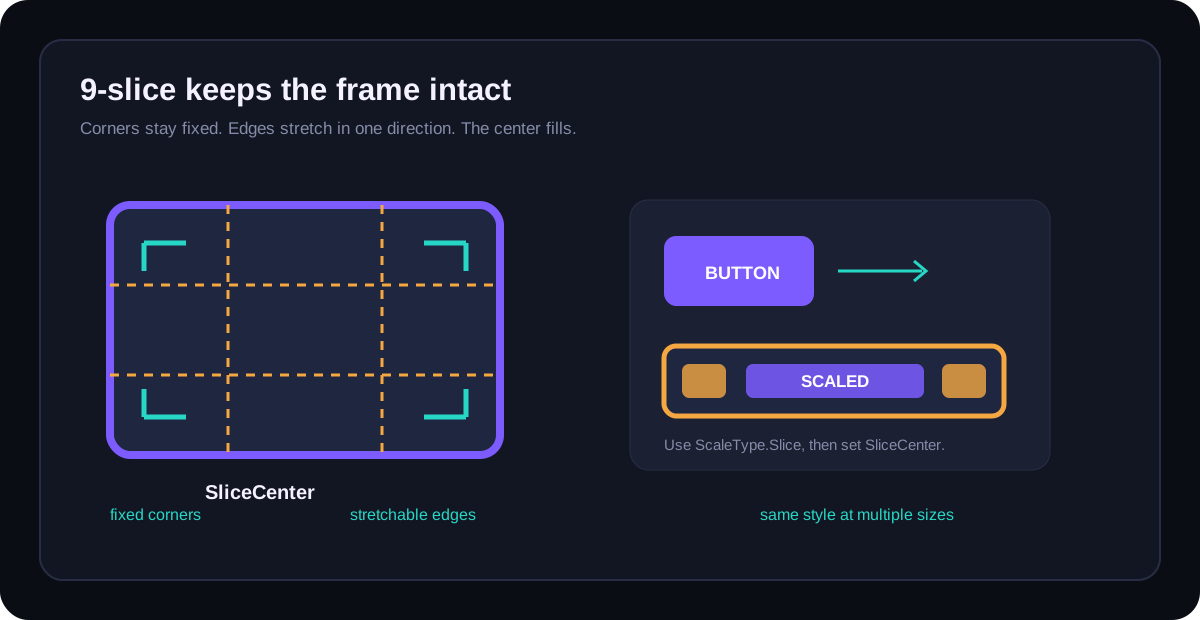
Use a source image with enough breathing room around the corners. If the border is four pixels wide in the source but you set a slice boundary through the middle of that border, Roblox will preserve the wrong pixels. Zoom in, place the four slice guides at the end of the fixed visual treatment and then test the asset at three widths.
Scale and Offset are not competing religions
Roblox's position and size documentation describes Scale as a proportion of the parent and Offset as a pixel adjustment. A practical pattern is to use Scale for the main placement and Offset for padding, minimum touch room or a small correction. Avoid building the entire interface from absolute pixel coordinates unless the surface is deliberately fixed.
AnchorPoint matters just as much. A centered modal should usually be anchored at 0.5, 0.5 so it grows around its center. A bottom-right notification stack should anchor from that corner so a longer message grows into the available space instead of moving away from the edge.
UIScale is a group control, not a rescue button
UIScale multiplies the absolute size of the parent UI element. That makes it useful for a complete HUD or a modal system with many children. It is not a replacement for readable typography. If the smallest supported device makes a label too small, change the layout or remove the label rather than scaling the whole screen until the button becomes a postage stamp.
Design the state system before the artwork
A consistent UI kit is a small state machine. Define the state changes before generating polished panels:
| State | Visual change | Do not rely on |
|---|---|---|
| Normal | Base surface, readable contrast | A tooltip to explain that it is clickable |
| Hover or focus | Small lift, outline, glow or value shift | Motion alone, especially on touch |
| Pressed | Short compression or darker inset | A sound that some players cannot hear |
| Disabled | Reduced contrast plus clear non-interactive treatment | Opacity so low that text disappears |
| Selected | Persistent border, fill or marker | Color alone when color blindness is a concern |
Keep a style bible small enough to use
Write down the palette roles, not only the color values: background, elevated surface, primary action, warning, success, focus and disabled. Do the same for corner radius, stroke width, shadow strength and icon scale. The goal is not a design-system document nobody opens. The goal is a short contract that lets a new panel look like it belongs beside the old panel.
Sprixen can help generate the visual ingredients for that contract, especially a family of icons, panels and small decorative motifs. The Mod Builder workflow is the relevant place to test generated Roblox-facing assets, but you still own the layout logic and Studio implementation.
Publish checklist
- Test every reusable frame at a narrow, medium and wide width.
- Confirm the SliceCenter boundaries preserve corners and border thickness.
- Check the longest realistic label, not only the placeholder label.
- Use UIAspectRatioConstraint for images that must stay proportional.
- Make selected and disabled states visible without color alone.
- Test with mouse, touch and gamepad focus where your experience supports them.
- Capture a Studio screenshot at the target device sizes before calling the kit complete.
Ready to try Sprixen?
Generate consistent, style-locked assets for your game. 6 free credits on signup, no credit card required.
Get Started FreeRelated Articles
Roblox 2D Asset Sizes in 2026: Icon, Thumbnail, UI, Clothing and Particle Cheat Sheet
A practical Roblox 2D asset reference covering discovery images, UI, classic clothing, layered textures, decals and particle flipbooks, with the mistakes that cause rework.
Roblox Particle Textures and VFX Flipbooks: Sizes, Alpha and the Mistakes That Kill Performance
A practical guide to Roblox ParticleEmitter textures and flipbooks, including grid layouts, alpha, mobile profiling and a safe export workflow.
Why Your Roblox Game Looks Inconsistent (and the 2D Asset Checklist That Fixes It)
The four visual contracts that make a Roblox game feel coherent across icons, UI, clothing, characters and effects, plus an audit you can run before buying more assets.