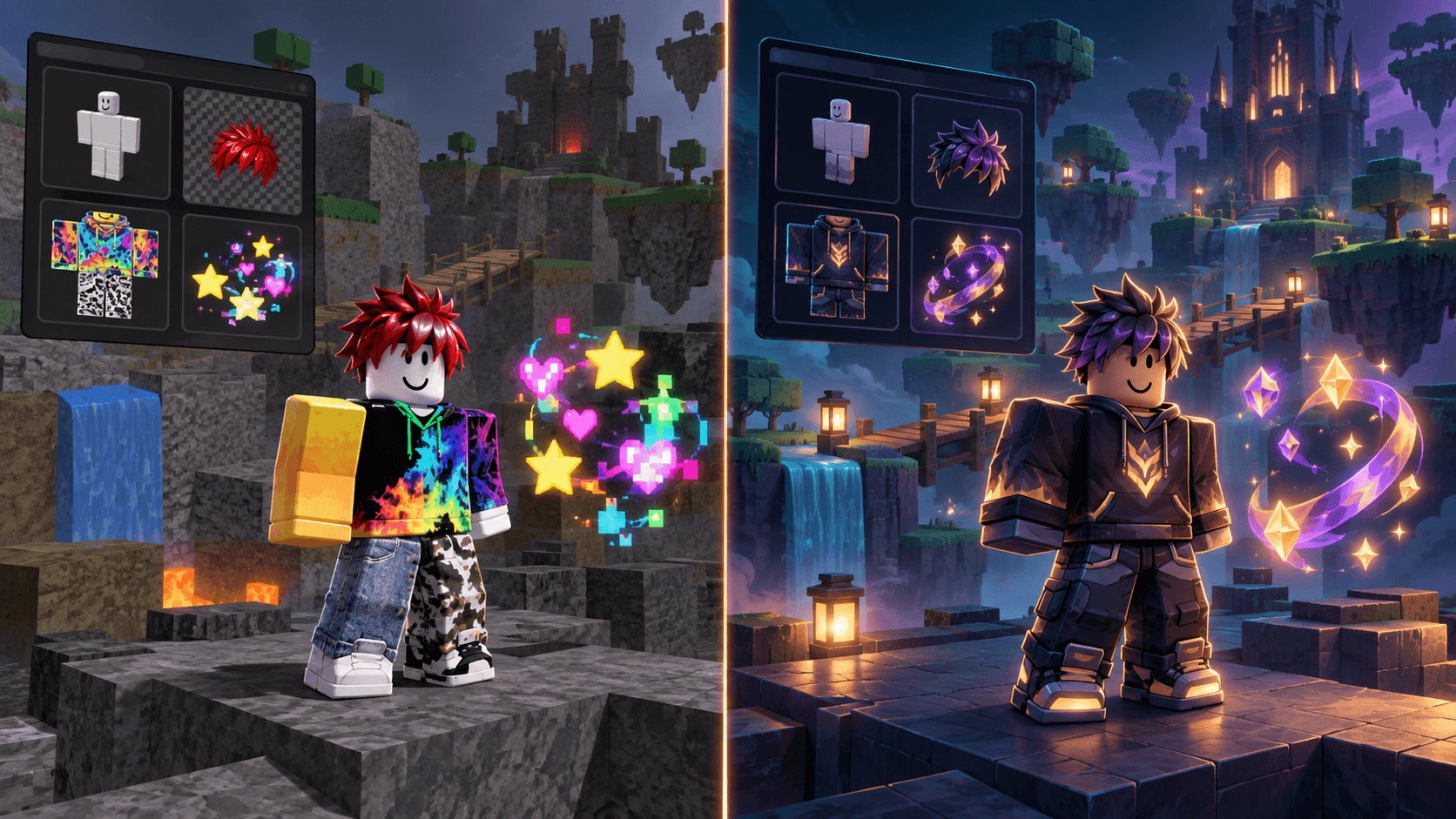
Why Your Roblox Game Looks Inconsistent (and the 2D Asset Checklist That Fixes It)
The four visual contracts that make a Roblox game feel coherent across icons, UI, clothing, characters and effects, plus an audit you can run before buying more assets.
A Roblox game can have individually attractive assets and still look unfinished. The usual reason is not a lack of detail. It is that the icon, thumbnail, UI, character, clothing and effects were made under different visual contracts.
Players read a game's style before they read its description. They notice proportion, palette, edge treatment and camera angle as one signal. If those signals disagree, the game feels assembled from a marketplace folder rather than designed as a world.
The four consistency locks
| Lock | Questions to answer | Visible symptom when it drifts | Fast correction |
|---|---|---|---|
| Palette | Which colors are base, accent, warning and background? | Every asset feels like a different season or game | Define role-based colors and remove one-off accents |
| Proportion | How large are heads, hands, props and UI icons relative to each other? | Characters look like they belong to different genres | Compare silhouettes at the same in-game scale |
| Edge and detail | Are outlines, gradients, bevels and texture density consistent? | Flat UI sits beside glossy art or noisy textures | Choose one edge language and one detail budget |
| Camera and perspective | Where is the horizon, light direction and viewing angle? | Props cannot share a scene without looking pasted in | Use a reference frame and repeat the same camera contract |
Run an asset audit before buying another pack
- Put the game icon, thumbnail, one screenshot, one UI panel, one character, one clothing texture and one effect on the same board.
- Convert the board to grayscale. If the focal hierarchy disappears, the problem may be value contrast rather than color.
- Resize the board until the icon is roughly 128 pixels. Note which subjects become unreadable first.
- Draw a line around the main silhouettes. Compare head-to-body, prop-to-character and icon-to-label ratios.
- Circle every edge treatment: outline, glow, bevel, shadow and noise. Count how many systems are competing.
- Mark the light direction and camera angle. A mismatch is more expensive than a missing detail.
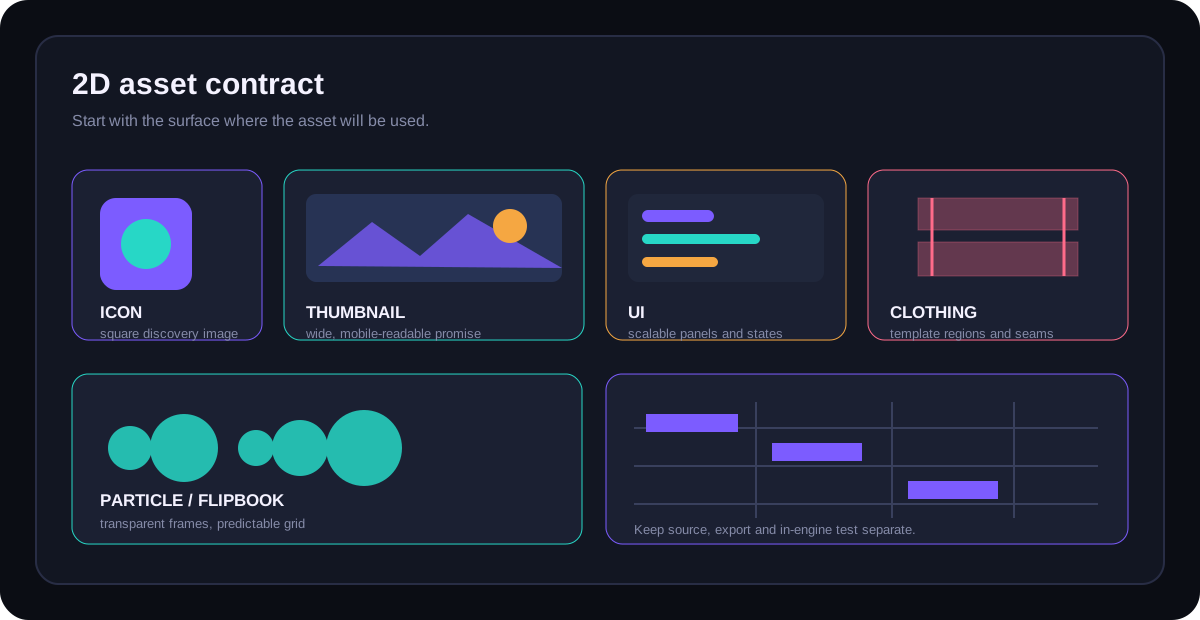
Why marketplace assets often fight each other
A marketplace asset is optimized to look good in its listing. Your game is optimized around a player loop, a camera and a specific amount of attention. Those goals are not identical. A prop can be excellent and still be wrong for your game because its perspective is too realistic, its texture density is too high or its outline weight disagrees with the characters.
This does not mean you should never buy assets. It means you should buy against a written contract. Ask whether the pack includes the variants you need, whether it uses the right license, whether the source format is editable and whether its creator documents the intended scale.
Make the next asset enter the existing style
Start from the assets that already work, not from a generic style phrase. Choose two or three references that show the palette, silhouette and camera. Write the negative rules too: no glossy PBR, no black outlines, no tiny text, no orthographic view, whatever your game needs to avoid.
Then produce a small test set before generating a hundred assets. One character, one prop and one UI element will expose a style mismatch earlier than a full batch. If the three do not look related, add constraints before adding volume.
This is also why the platform's own interface guidance matters. Roblox's UI documentation treats position, size, layering and reusable GuiObjects as part of the experience rather than decoration. Your art direction should make those same rules visible in the assets.
Consistency is not sameness
A good visual system leaves room for hierarchy. A boss can be brighter than a background prop. A warning state can break the base palette. A special effect can be more luminous than a normal button. The rule is not “everything uses the same colors.” The rule is “every exception has a reason the player can understand.”
A practical six-asset checklist
| Asset pair | Compare | Pass condition |
|---|---|---|
| Icon and thumbnail | Focal subject and promise | A player can identify the game in both crops |
| Character and clothing | Proportion, edge and material | The clothing belongs to the same body and world |
| UI and icon | Stroke, radius and color roles | The interface feels native to the game art |
| Prop and environment | Perspective and light direction | The prop does not look pasted into the scene |
| Effect and gameplay moment | Silhouette and emphasis | The effect explains an event instead of hiding it |
Sprixen's useful role here is not producing one “perfect Roblox style.” It is helping a creator make a set of related assets from a project direction, then inspect the result as a set. If you want to test that workflow, the Roblox asset workspace is the relevant starting point. Keep the audit board and the in-engine test as the final authority.
Ready to try Sprixen?
Generate consistent, style-locked assets for your game. 6 free credits on signup, no credit card required.
Get Started FreeRelated Articles
Roblox 2D Asset Sizes in 2026: Icon, Thumbnail, UI, Clothing and Particle Cheat Sheet
A practical Roblox 2D asset reference covering discovery images, UI, classic clothing, layered textures, decals and particle flipbooks, with the mistakes that cause rework.
Where to Buy and Sell Roblox Assets in 2026: Creator Store, ClearlyDev and the Alternatives
A practical comparison of Roblox asset marketplaces, including Creator Store, ClearlyDev, avatar Marketplace and general stores, with fees, licensing and buyer risk.
Roblox UI Kit Guide: 9-Slice, Scale Types and a Style That Holds Together
How to build Roblox UI art that survives different screen sizes using 9-slice, UIScale, constraints, readable states and a shared visual system.